audibene Landing Page design
- Office: audibene GmbH
- Location: Berlin Germany
- Date: 2018

In previous years audibene used the same template for all their landing pages regardless of the offer. This was something that needed to be addressed to improve conversion rates for the company’s premium range offer.
The major problems I had to overcome were how to:
1. Increase conversions rates
2. Explain the benefits of modern premium hearing aids
3. Be informative, intuitive and easy to navigate for their older target audience
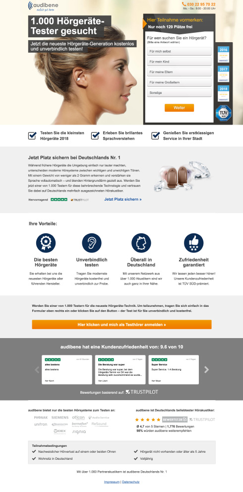
The challenge was to design a brand new landing page completely changed from what had come in the past with a premium tone. Two other stipulations from the product team were that it also had to warm and welcoming and communicate a trust for audibene.
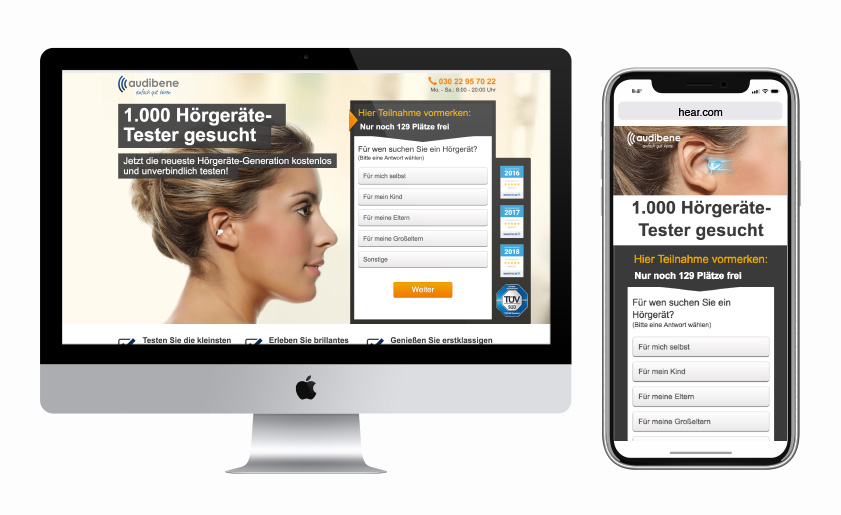
As with the hear.com page a holistic marketing approach was a good starting point. Using dynamically loading teaser images so that when a user clicks on a creative ad and are taken to the landing page a relatable teaser imagery and headline are displayed.
All key information is placed above the fold, with the ear model below the headline and looking towards the form. Having the model looking at the form works on a psychological level. A user responds better to a smiling face and will subconsciously follow their line of sight. By having the ear model look towards the form the user follows and is drawn to the most important element of the landing page. This creates a flow to the above the fold section of the page, the user reads the headline, flows to the model and follows the models line of sight to the form.
To build trust awards audibenes various awards are added next to the from and further down the companies KPI’s. Included in the footer is a trust pilot widget showing reviews and the companies rating on an internationally recognized assurance service.
All things combined this landing page design and build increased conversion rates by 26% in the German market. This design was also translated into the audibenes Asian markets where it had a 36% increase in conversion over the previous design.