X
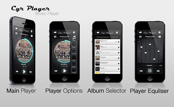
Cyr Music Player
- Office: Cyr Player
- Function: Beta concept app
- Date: 2016
I was asked by an old colleague to design a concept for a beta version of a music player. The brief was simple a modern UI that was simple, intuitive and easy to use from a first glance. There was one major design input from the owner it was "not allowed to be a flat design".
Intuitive and easy to use was achieved via use of clear icons with a subtle text titles. The player uses a circle timeline to give it a unique look and feel while still working in the conventual way.