hear.com Landing Page design
- Office: hear.com
- Location: Miami USA
- Date: 2018

Landing pages are a constantly developing product and audibene and hear.com require different designs for each global culture and country.
The major problems I had to overcome in the design process were how to:
1. Increase conversions rates
2. Explain the benefits of modern hearing aids
3. Appeal to an older user base and be customer friendly
My challenge was to design a new landing page for hear.com in the USA that would appeal to their specific customer demographic and increase conversion rates.
Using a holistic approach including marketing was the first idea to be included in the design. This meant using dynamically loading images in the teasers. When the user clicks on a display or social media ad and get taken to the landing page the teaser image will reflect the creative image from the display add. This is not always a direct duplicate of the display creative but follows the same story from the advertisement.
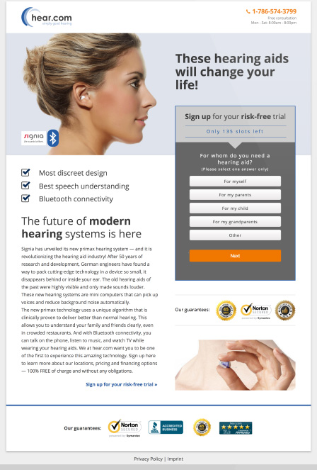
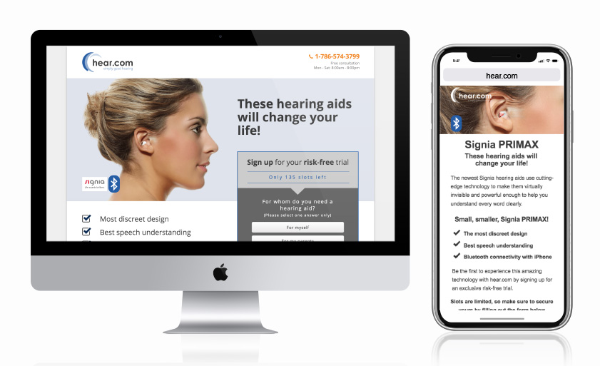
Modern hearing aids are nothing like what many people expect hearing aids to be and the landing page must sell this information in little amount of space. Through testing it was discovered that higher conversion could be achieved by having a shorter desktop page but a longer mobile page.
I decided to use darker colours to make the form stand out from the page. All the content on the desktop layout is designed to flow towards the form. The teaser image is always a profile view of an ear model looking towards the form and headline. The headline is broken down into three gradually shorter lines creating a subtle point towards the from.
This approach and design led to over a 30% in conversion rates and leads.